Geometria Font
Geometria is a clean geometric sans-serif font with a modern style. Moreover, it uses simple shapes like circ…

Slides are read at distance, in bad lighting, by people who are half listening. The fonts here were chosen for exactly that: open letterforms, strong bold weights for titles and numerals that stay clear in charts and tables.
They suit pitch decks, conference talks, training material, quarterly reviews and webinars. Download is free; a deck shown to clients is commercial use, so check the ZIP license before it leaves the building.
Ranked by fit for this use, then by popularity. Every font has a preview page and a free download.
Geometria is a clean geometric sans-serif font with a modern style. Moreover, it uses simple shapes like circ…
CartoGothic Std is a clean and modern sans serif font designed for both print and digital use. Its balanced l…
Kenyan Coffee delivers a bold, condensed sans serif style with a modern edge. Its tall letterforms and clean…
She’s cute, she’s bold, she has curves in all the right places. It’s Babe Sans. She’s clean, legible, modern…
KFC Font takes inspiration from the bold and confident lettering of the famous fast-food brand. Its clean lin…
Avant Garde Gothic is a geometric sans serif typeface known for its clean lines and bold shapes. Originally d…
Introducing Dekamor, a classy and modern font that will take your designs to the next level. With its strong…
Meticula is a sans-serif font family which provides 18 font sets. It meticulously supported complex geometric…
Stara Font is a sans-serif family that combines simplicity and elegance. With its clean design and balanced p…
Unitea Sans is a modern geometric sans serif font. It offers six weights from Regular to Black, plus italics.…
Arimo is a clean and modern sans serif font designed for clear readability on screens and print. Its balanced…
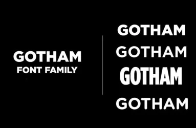
Gotham is a modern and sans serif typeface created by Tobias Frere Jones in 2000. Borrowing its design from a…
Segoe UI Font brings clean, modern design to your digital projects. This typeface works great for screens and…
TheSans is a modern sans serif font family of the Thesis superfamily by the Dutch type designer Luc(as) de Gr…
The Los Angeles Dodgers, a professional baseball team in Major League Baseball, has a rich history and legend…
Axiforma is a geometric sans serif font family with a strong emphasis on legibility and contemporary design c…
News Gothic is a simple and clean, geometric sans-serif font family that has enjoyed timeless popularity with…
Sequel Sans, which is a neo-grotesque font, presents flexibility and versatility. It represents an excellent…
The Gilroy font is a modern and versatile sans-serif typeface created by Radomir Tinkov. Designers worldwide…
Braggadocio is a bold stencil font with powerful presence. Moreover, it brings Art Deco style to modern desig…
Modern Script Fonts Bundle 25 incredible script fonts to your arsenal with this bundle that has a total value…
Helixa is a neo-grotesque typeface with a clean & modern design and an enduring appearance. This is a perfect…
Bebas Neue is a bold and versatile sans-serif font family that has become popular since its release in 2010.…
Neue Haas Unica is a modern sans-serif font family that combines the best features of Helvetica and Univers,…
Title at 36 to 44 pt, body at 24 to 28 pt, never below 20 pt. One font family, two weights, left aligned. Six lines per slide is a hard ceiling; if you need more, you need another slide. Dark text on light backgrounds reads better in bright rooms, the reverse in dark ones, so ask about the venue before you finalise the theme.