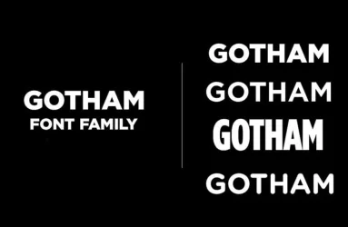


Gotham Font Family
Gotham is a modern and sans serif typeface created by Tobias Frere Jones in 2000. Borrowing its design from a…

A business card is the smallest piece of typography most brands ever print: a name at 9 pt, a phone number at 7. The fonts below were chosen for exactly that job, with open letterforms, clear numerals and enough contrast between weights to separate a name from a title without shouting.
All are free to download for Windows and Mac and install in Word, Illustrator, Canva or any print tool. The license in each ZIP tells you whether a company's printed cards are covered; many of these fonts allow commercial use outright.
Ranked by fit for this use, then by popularity. Every font has a preview page and a free download.
Gotham is a modern and sans serif typeface created by Tobias Frere Jones in 2000. Borrowing its design from a…
Made Mirage is a unique font created by MadeType, a world-class design studio, which underlines the importanc…
Geometria is a clean geometric sans-serif font with a modern style. Moreover, it uses simple shapes like circ…
Gordita is a minimalist sans serif font family by Thomas Gillett and lettering by iKern engineer. Gordita is…
Segoe UI Font brings clean, modern design to your digital projects. This typeface works great for screens and…
Unitea Sans is a modern geometric sans serif font. It offers six weights from Regular to Black, plus italics.…
The Los Angeles Dodgers, a professional baseball team in Major League Baseball, has a rich history and legend…
Avant Garde Gothic is a geometric sans serif typeface known for its clean lines and bold shapes. Originally d…
The Telegraf font is a modern geometric sans serif with a clean and structured design. Its balanced proportio…
MADE Outer Sans is a new modern sans serif font family by MadeType foundry. This font is extremely useful whe…
CartoGothic Std is a clean and modern sans serif font designed for both print and digital use. Its balanced l…
Gendy is modern sans font by RantautypeStudio insprire by modern grotesque with geometric details and deep in…
Arimo is a clean and modern sans serif font designed for clear readability on screens and print. Its balanced…
Looking for a typeface that perfectly captures the essence of industrial precision and futuristic design? Loo…
Nexa, a practical and eye-catching sans serif font created by Fontfabric, has gained popularity and is widely…
Meticula is a sans-serif font family which provides 18 font sets. It meticulously supported complex geometric…
Stara Font is a sans-serif family that combines simplicity and elegance. With its clean design and balanced p…
Migae is a display font designed to stand out. With 14 weight variants from Light to Black and refined italic…
Zrnic Font: Looking for a typeface that perfectly captures the essence of industrial precision and futuristic…
Albra is a modern and elegant serif font family designed by Yang Lu and released by BumBum Type. Albra is a c…
Helvetica is the most widely used font. It was created in 1957 by Max Miedinger, a Swiss typeface designer, a…
Lemon Milk is a geometric sans serif font family that has found its place in the design society and is admire…
Bebas Neue is a bold and versatile sans-serif font family that has become popular since its release in 2010.…
Champion Gothic font is one of the most stylish and elegant fonts with a long history since the early 20th ce…
Keep contact details at 7–8 pt in a regular weight and the name at 10–12 pt in medium or bold; light weights vanish on uncoated stock. Use one family, two weights, and align everything to a simple grid. Check that the phone number's digits are distinguishable (1, l and 7) and export as PDF with fonts embedded.