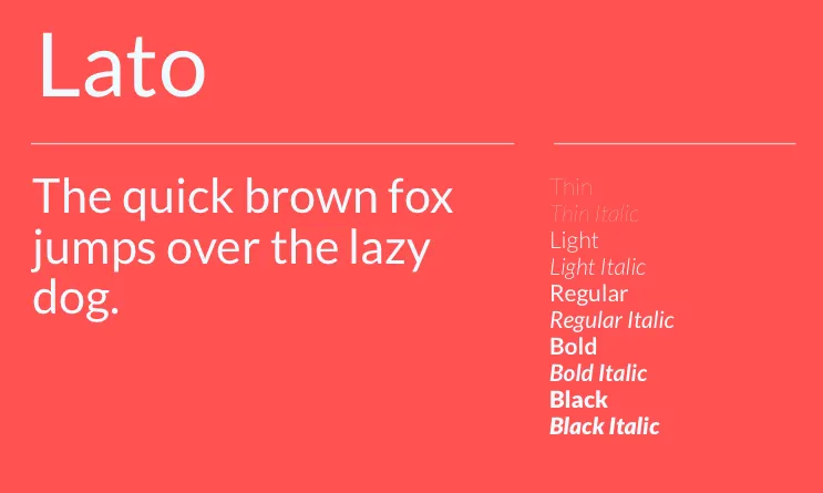
Explore different fonts
Lato Font takes its name from the Polish word for “Summer”. It is a sans serif font developed by Warsaw designer Lukasz Dziedzic in the summer season 2010. In December 2010, Lato was released under the Open Font License by the tyPoland foundry with the help of Google.
During the last 10 years of Lukasz’s design process, most of his projects were based on a specific design task he had to do. It was similar with Lato. Initially, the Lato Font Family was conceived as a set of corporate fonts for a large client, but in the long run he decided to go in a different stylistic direction, so he continued Lato Font as a publicly available, free font family.
While working on Lato, Lukasz tried to carefully balance some potentially conflicting priorities. He designed a typeface that would look very “transparent” when used in body text, but would exhibit some original features when used in larger sizes. He made use of classical proportions (especially visible in capital letters) to offer a familiar harmony and elegance to the letterforms. Created in 2010, Lato is a sans serif with an elegant design, although it does not follow current design trends.
The semi-rounded structure of the letters gives Lato a sense of warmth, while the strong structure provides stability and seriousness.


